Shield
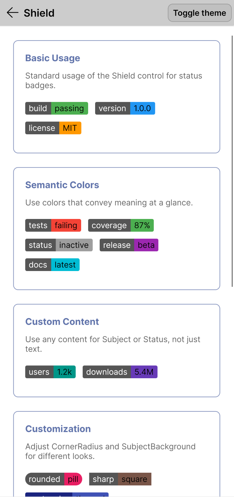
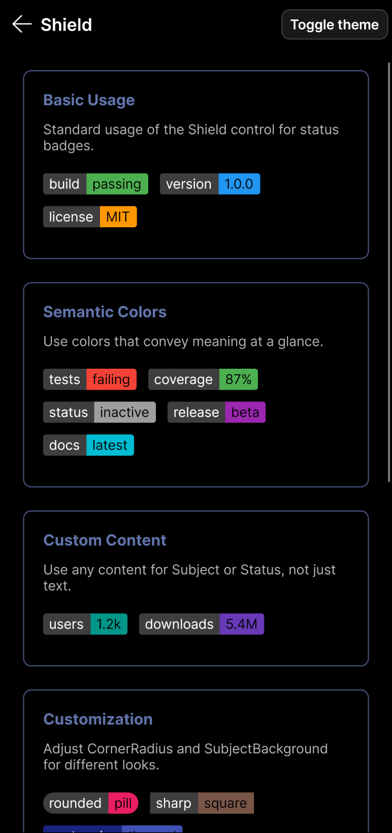
The Shield control displays a subject and status with distinct background colors for each part. It is commonly used for build status, package versions, licenses, and other compact metadata.
Usage
<controls:Shield Subject="Build" Status="passing" Background="Green" />
Properties
| Property | Type | Description |
|---|---|---|
| Subject | object |
The content displayed on the left side (subject). |
| Status | object |
The content displayed on the right side (status). |
| Background | IBrush |
The background color of the status part. |
| SubjectBackground | IBrush |
The background color of the subject part. |
| IsReadOnly | bool |
When true, the shield is display-only with no interaction but full opacity. |
| CornerRadius | CornerRadius |
The corner radius of the control. Defaults to the theme's default. |
Examples
Basic Usage
<StackPanel Spacing="10" Orientation="Horizontal">
    <controls:Shield Subject="Build" Status="passing" Background="Green" />
    <controls:Shield Subject="Version" Status="1.0.0" Background="Blue" />
    <controls:Shield Subject="License" Status="MIT" Background="Orange" />
</StackPanel>
Colors
You can customize the color of the status part using the inherited Background property.
<controls:Shield Subject="Red" Status="Failed" Background="Red" />
<controls:Shield Subject="Blue" Status="Info" Background="DodgerBlue" />
Custom Content
Since Subject and Status are of type object, you can put any content inside them.
<controls:Shield Subject="Users" Background="Teal">
    <controls:Shield.Status>
        <StackPanel Orientation="Horizontal" Spacing="4">
             <PathIcon Data="{StaticResource UserIcon}" />
             <TextBlock Text="1.2k" />
        </StackPanel>
    </controls:Shield.Status>
</controls:Shield>
Read-Only Mode
Use IsReadOnly for display-only badges that maintain full opacity without interaction.
<controls:Shield Subject="build" Status="passing" Background="Green" IsReadOnly="True" />